Categorize Tickets and Work Items based on Priority using Color Schemes
Categorizing locates, color scheming locates to due today, tomorrow, emergency and so forth, quick color code is faster than hovering or opening a locate request

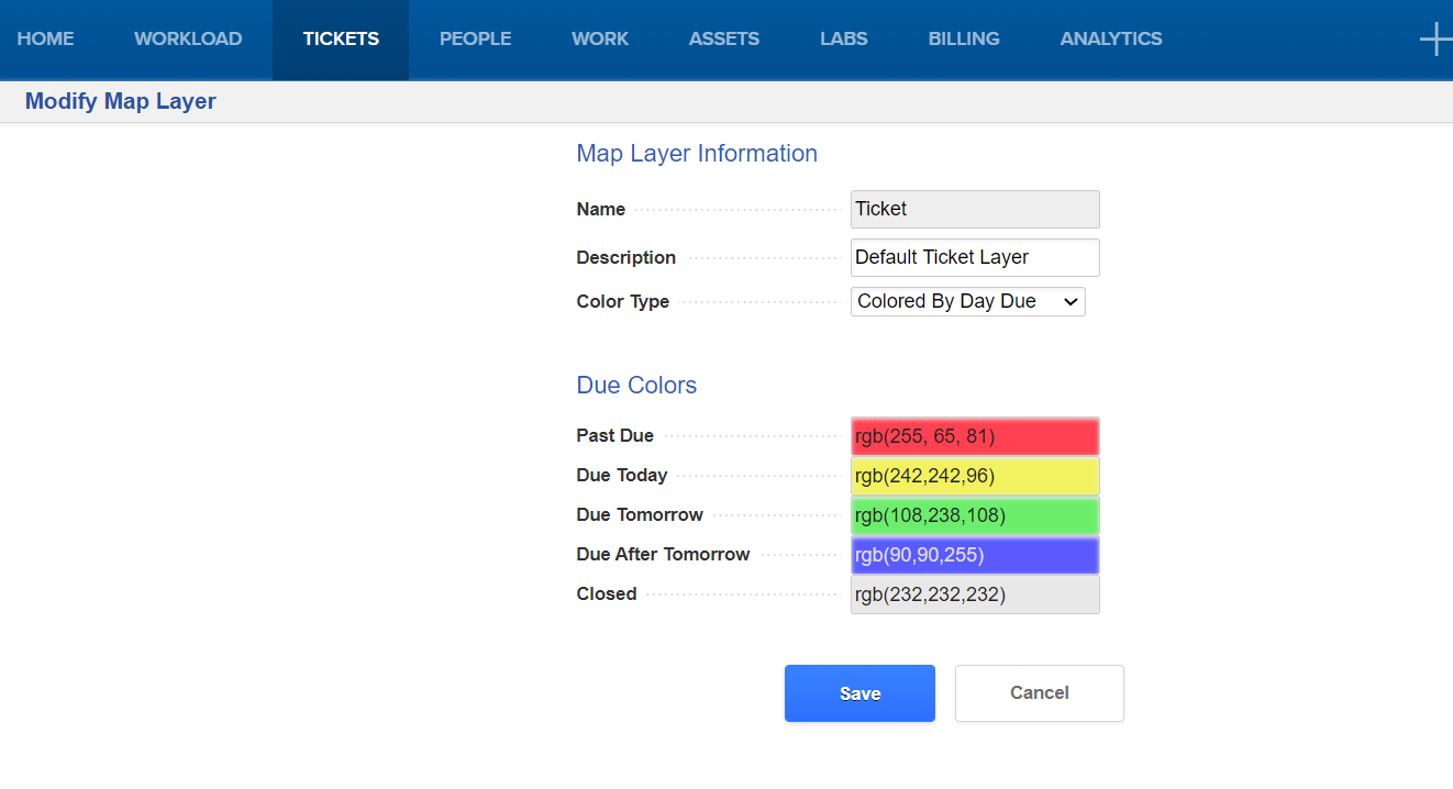
We have added this ability for the maps in UtiliSphere. You can configure it by doing the following:
1. Login to UtilliSphere
2. Click on the Gear icon (in the upper right)
3. Click on Map Layers
4. Under the "Item Map Layers" section click on Ticket
5. Click on Modify this Map Layer
6. In the Color Type drop down there are 3 options:
- Single Color
- Color by Ticket Type
- Color by Day Due
7. Select your preference
8. You can also click on colors to modify the colors

Let me know if this helps

We have added this ability for the maps in UtiliSphere. You can configure it by doing the following:
1. Login to UtilliSphere
2. Click on the Gear icon (in the upper right)
3. Click on Map Layers
4. Under the "Item Map Layers" section click on Ticket
5. Click on Modify this Map Layer
6. In the Color Type drop down there are 3 options:
- Single Color
- Color by Ticket Type
- Color by Day Due
7. Select your preference
8. You can also click on colors to modify the colors

Let me know if this helps
Will this feature make it to the actual ticket summary screen? We had a similar request from our end users to be able to colorize tickets in the summary window view so it was easier to see what was more urgently due without looking at the dates for each.

Will this feature make it to the actual ticket summary screen? We had a similar request from our end users to be able to colorize tickets in the summary window view so it was easier to see what was more urgently due without looking at the dates for each.
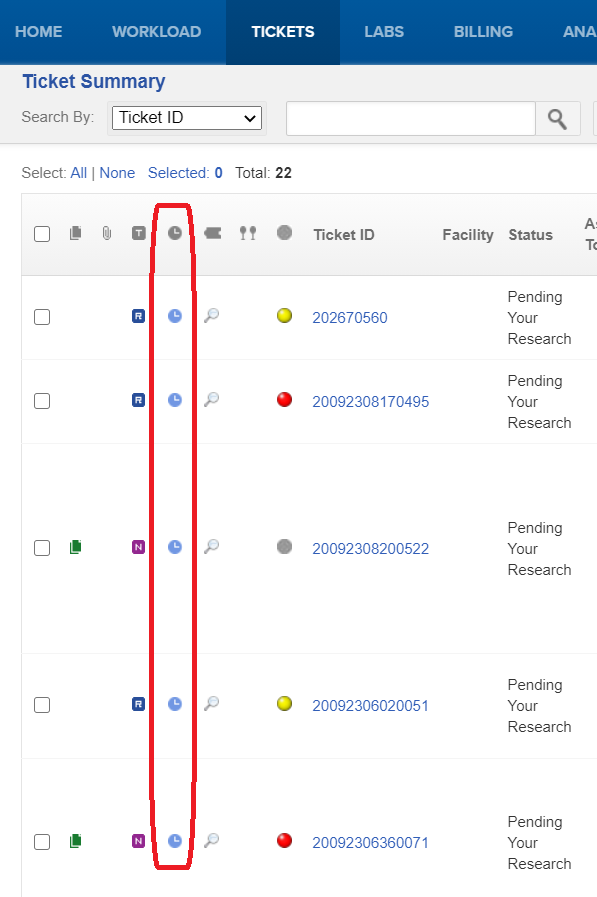
On UtiliSphere Full Web, we display a Due Time Icon. This icon shows a different color based on the due time. In the below example all of my tickets are due in 1 day. But if they were past due, they would be a much darker blue.
Would this help your users?


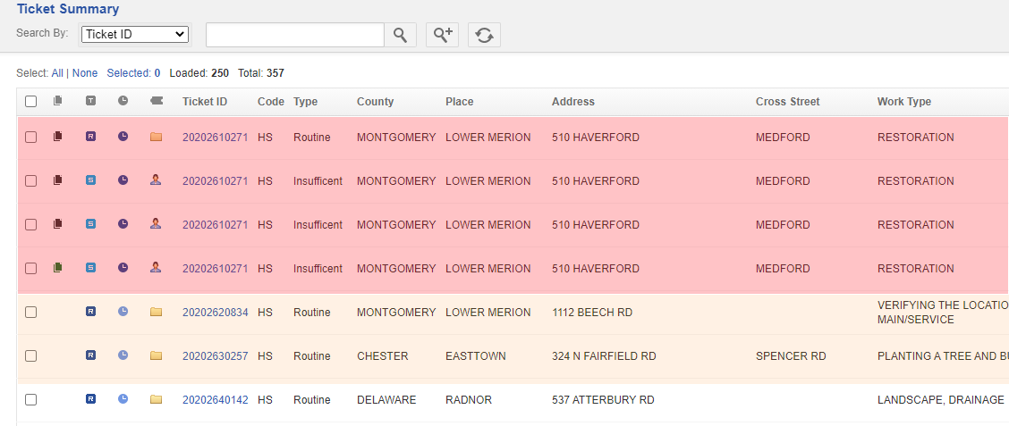
That blue is hardly noticeable from my screenshot below, the thought was the entire row being colorized as a screen feature would give them a better understanding regardless of individual due date.
Red = Overdue
Orange = Due soon (upcoming 24-48 hrs?)
Yellow/Noncolored = Due 3+ days out
Rough example.. colors would be customizable as I am not sure everyone would want to follow this scheme:

Will this feature make it to the actual ticket summary screen? We had a similar request from our end users to be able to colorize tickets in the summary window view so it was easier to see what was more urgently due without looking at the dates for each.
On UtiliSphere Full Web, we display a Due Time Icon. This icon shows a different color based on the due time. In the below example all of my tickets are due in 1 day. But if they were past due, they would be a much darker blue.
Would this help your users?